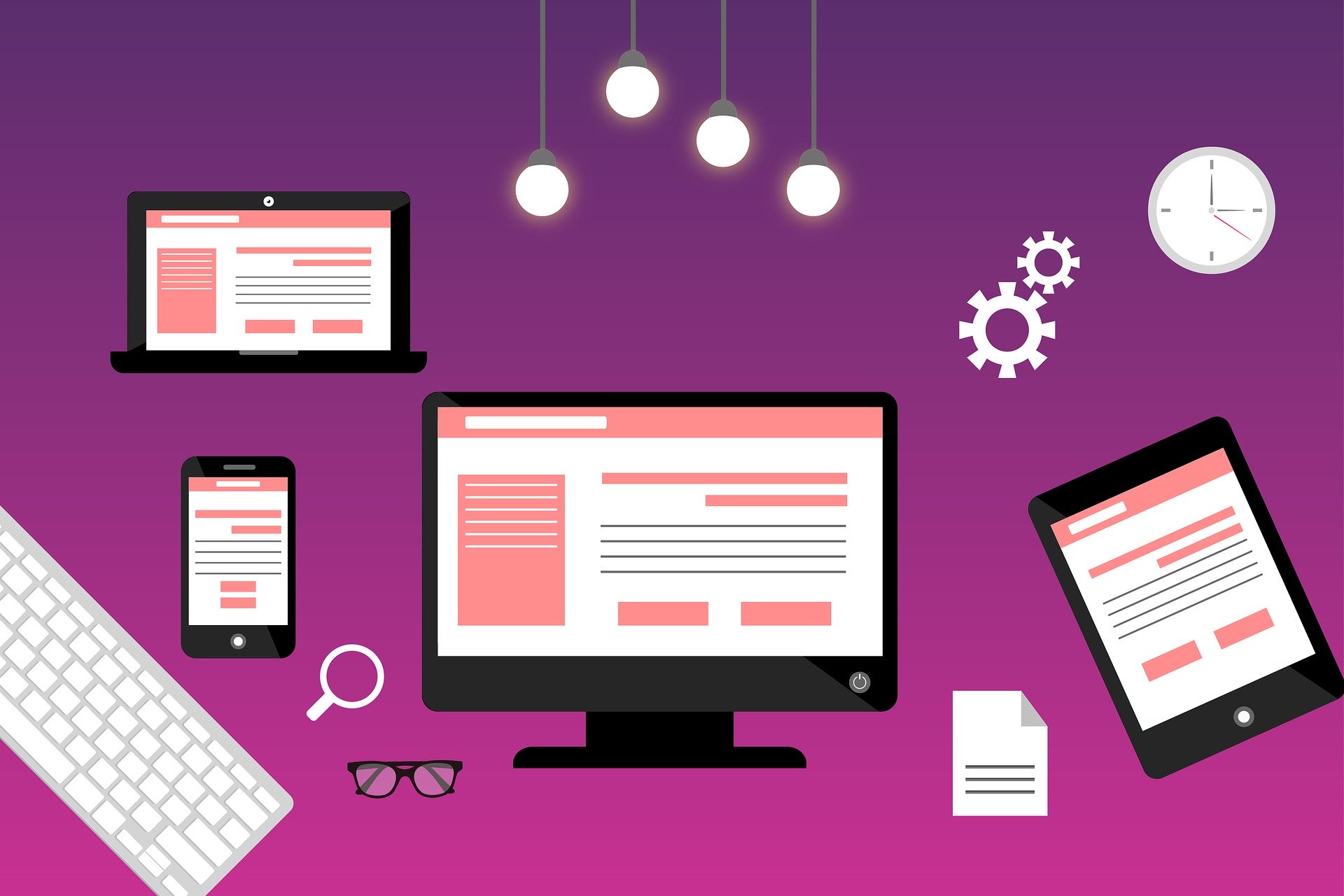
Previous to this concept, to learn the complete information on the page, one required to either move through X-Y coordinates by scrolling left-right using touch OR zoom out the even worse display. Whereas, in Responsive Web Design, there is no need for scrolling left-right or zoom-in zoom-out anymore. Responsive web design and development allow designs, images and text and most of the front-end elements to respond according to the device or screen size. The best responsive web design services use fluid grids, flexible images, and CSS to provide a website as per the width of the browser. For Responsive Web designer, the ultimate aim must be preparing the UI and UX of a website design across various devices and screen sizes. Ynot Infosolutions is one of the best Web designers in Kerala, India Taking full advantage of the growing technologies, They can build Responsive websites that are device-independent. Imagine your website visitor has to zoom-in to read the text or see an image on their mobile device. And your opponent has a mobile responsive website where the same user gets a much more satisfying user experience because of the Responsive Web Designing. Another key feature is understanding the visitors and what kind of devices they are using. The statistics itself shows Responsive Web design has growing demands. Over here, designing a website that is fit with all browsers and its several versions, as well as with the hardware devices is the much-preferred option. As the best Responsive website designing company in kerala, india Ynot creates the best responsive website designs that can perform dynamic changes to the website’s appearance according to the device you are using.Overview of Responsive Website Design
Why Responsive Web Designing is so valuable:
Key elements of Responsive Web Design:
Advantages of using responsive Web Design: